COMPANY NEWS
 by Roman Vrublivskyi
Posted on Mar 27, 2024
New! SmartHub’s Analytics Dashboards: Ensuring Data-Driven Optimization
by Roman Vrublivskyi
by Roman Vrublivskyi
Tracking the performance of your SmartHub ad exchange allows you to understand its overall effectiveness as well as to optimize it in a data-driven way. Now, this task is much easier to deal with — let us introduce an analytics dashboard on SmartHub!
It is divided into 3 main tabs: dynamic rates, QPS dashboard, and performance dashboard. Let’s explore their functionalities.
The dynamic rates tab shows the main information about the platform and visually illustrates its overall results.
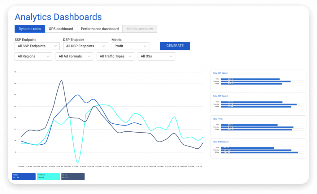
On the right side of the tab, you can see bar charts providing data on the key metrics:
Each has three time range options: today, yesterday, and 2 days ago. For each category, the data is provided in the format of $000.00K.
The line chart displays the total profit by default, while the default time range is the last 3 days. However, you can customize the chart according to your needs. In the upper part of the dashboard, you can see a lot of filters, and if you select a different metric, the line chart will change accordingly. For your convenience, the graph illustrates hourly changes, and in every peak spot, you will see a comment with the date, time, and total numbers.
The overall selection of filters for generating custom reports is as follows:
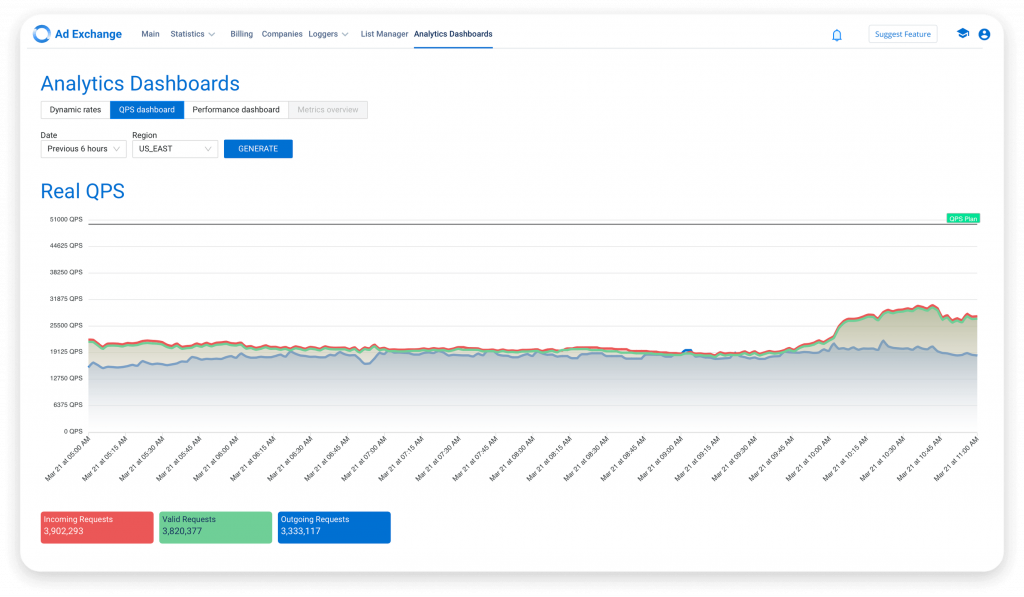
The QPS dashboard contains the data for the server load (QPS) on the platform, and the time range selection includes the following options:
Depending on your choice, the display of the time range will change accordingly. For instance, the last 6 hours (which is a default option) get divided by every 15 minutes, while the last hour — by every 5 minutes. Additionally, you can select a region from the drop-down menu (US East is set up by default) to customize your report.
Note that you will see two graphs within the QPS tab. The first one is Real QPS, and it has three lines: incoming requests, valid bid requests, and outgoing requests.
The second graph is Bid QPS, with two lines: demand bid QPS and supply bid QPS.
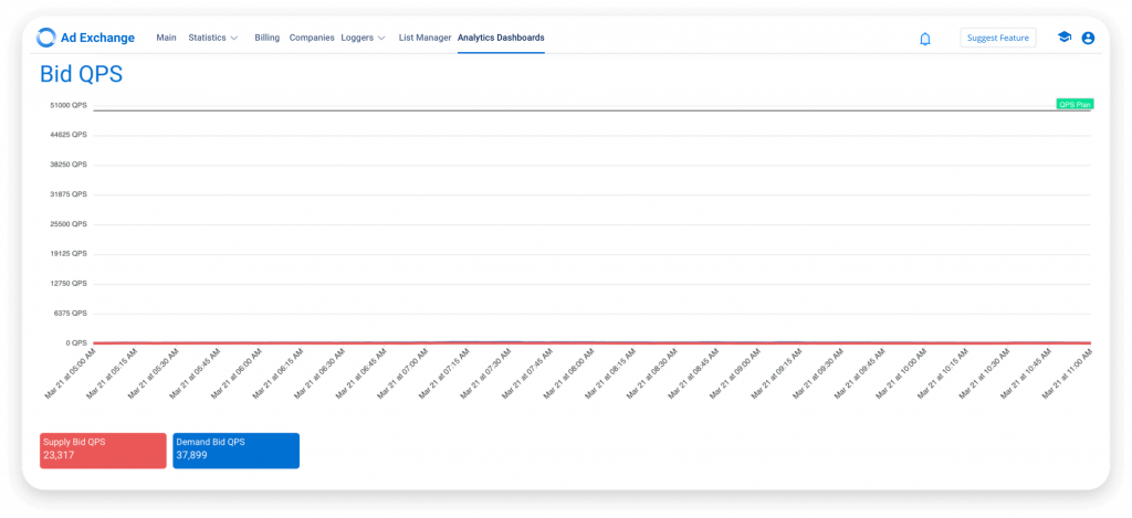
Both graphs have the same structure. The Y axis shows QPS data (your QPS plan is set by default), while the X axis illustrates the time range according to your selection.
How to analyze performance of your SmartHub ad exchange? The performance dashboard tab offers a comprehensive overview of your platform’s performance with intuitive filters and insightful visualizations. To help you identify your top-performing partners, it displays the following data:
To provide a visual representation of the profit distribution, the dashboard also includes seven pie charts covering the following categories:
Every chart offers insights into the percentage of profit for the top 5 values within the respective categories.
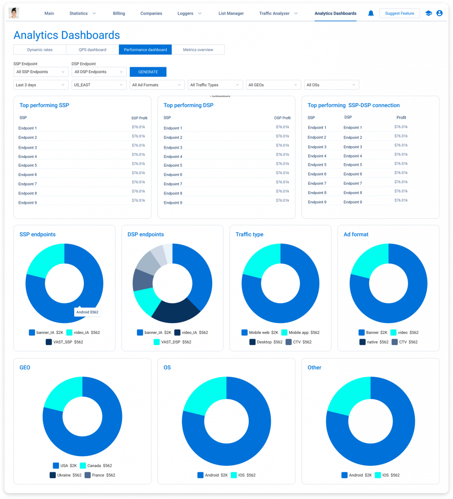
To customize your insights, feel free to apply our advanced filters:
With the dynamic rates tab, QPS dashboard, and performance dashboard, monitoring and optimizing your platform’s performance has never been easier. Dive deep into your data, identify trends, and make informed decisions to drive success in your campaigns.
Besides, since we are continuously improving the SmartHub programmatic solutions, you can expect new analytics functionalities. One more tab, metrics overview, will be released soon, so make sure to monitor updates on our blog.
You May Also Like
Want to Learn More?
Want to Learn More?
We'll get back to you very soon.


